I made a math channel in my data software (RaceStudio for my Mychron) that is my clutch slip. If you know that, fully locked up, you are at 55mph and 6100rpm, then you get 0.009 mph per rpm. So with my channel “lockup=100*[speed / (rpm * 0.009)]”, I can see when the clutch is fully engaged (lockup=100) and when it is not. Obviously this won’t apply to spark-derived rpm when hitting the limiter since that is no longer the actually rpm.
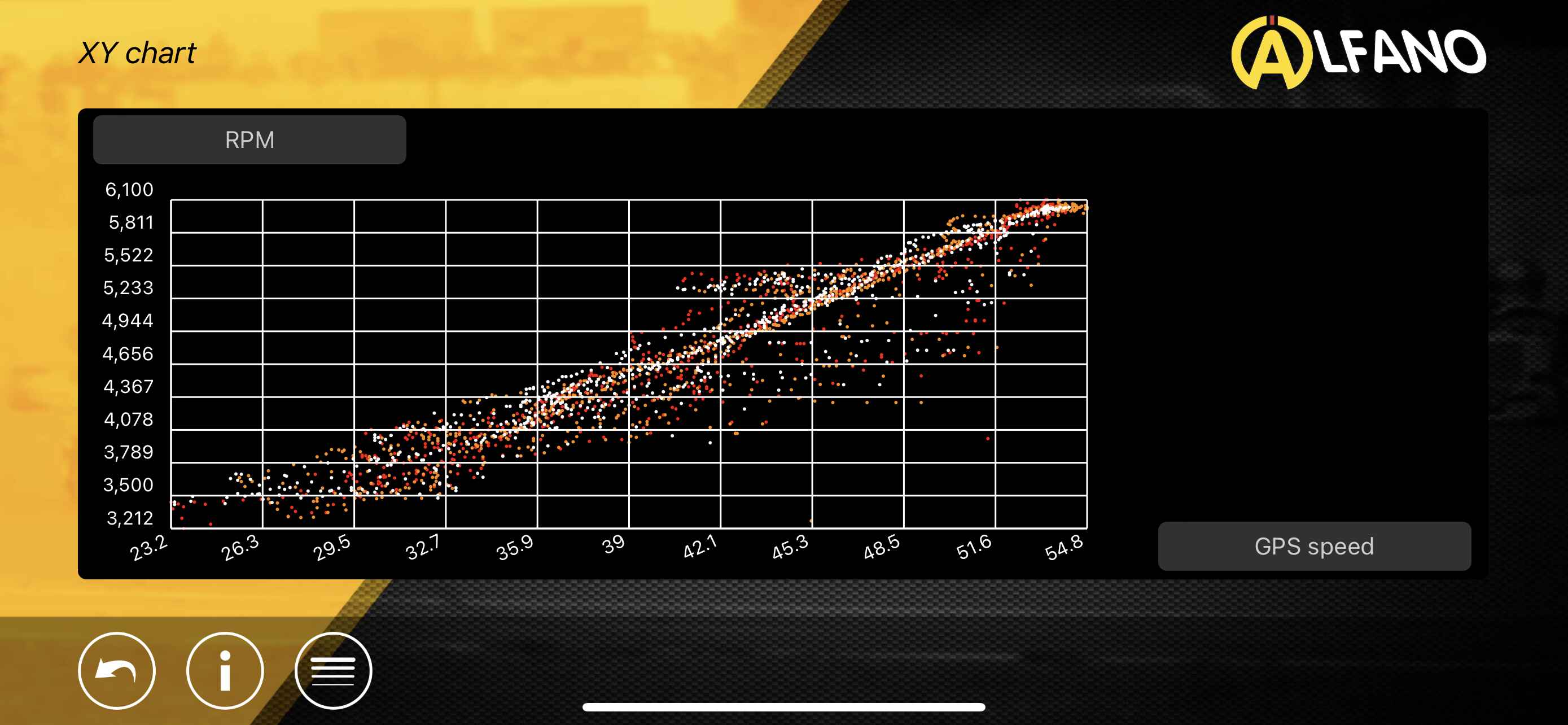
The quicker but less quantifiable way is to just do a scatter plot with mph on the x-axis and rpm on the y-axis. When fully engaged, you should get a dead straight line. With slip, you’ll get a curved line with a bunch of vertical variation. I just checked mine last night and, well, I placed an order for new shoes and springs, haha.
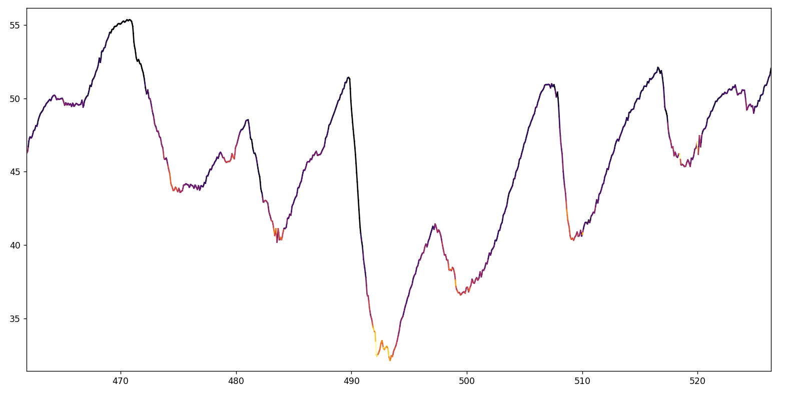
Ok @dodo, so 2 plots from regional races. With all the scatter and noise, I find it tough to see a real trend??? Any points above the trend line indicate slipping. So what I struggle with is discerning driver behavior, noise, and clutch slip impacting the plots.
We were setup for 3000 rpm engagement both tracks. One track was super tight, so you see plenty of data down close to 3000, the other track was very large with almost no data near 3000 after the starts.
I don’t see anything that would concern me, I’ve seen way worse. I will warn you, talking about clutch spring color combinations are very subjective. I’ve tried (not them all) but alot, and never noticed a huge difference. I have noticed notable differences between clutches themselves.
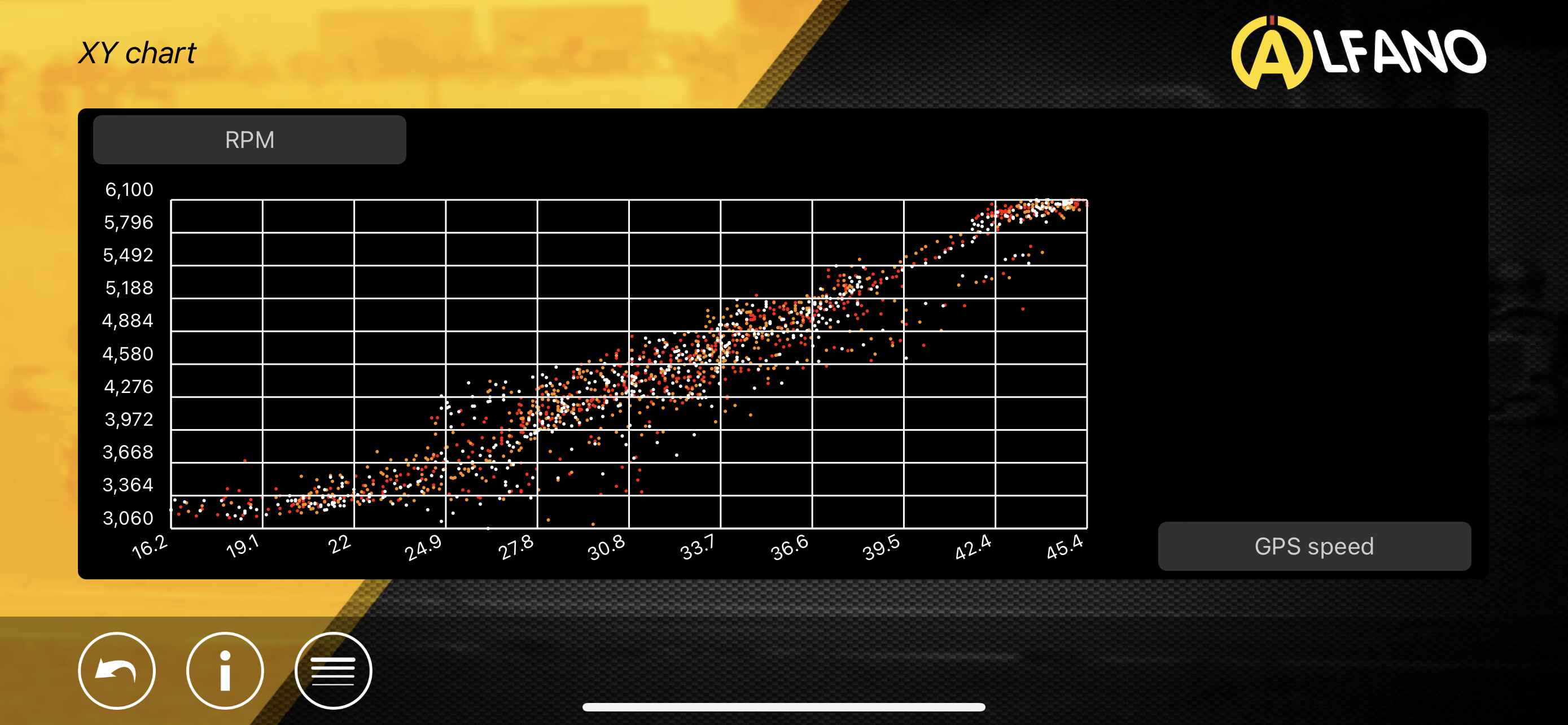
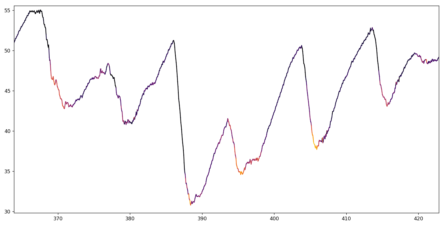
Yeah, the flat trend line from 16-20mph on the second trace is very little engagement as you’d expect. It’s great having that data because you can see the engagement point pretty clearly and keep an eye on it. As the springs get tired, you should see that drift up.
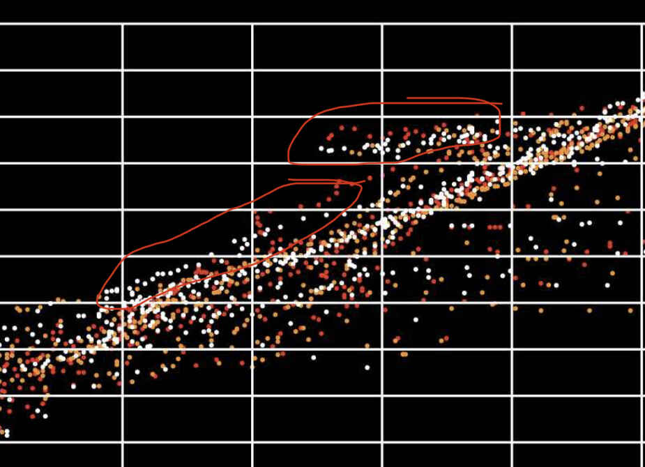
On the first trace, I circled two interested sections from the white lap. One section, the data is parallel to the trend line, so this looks like more than just noise. Could it have been tire spin? I’ve occasionally gotten some power wheelspin when the stars align but it isn’t a frequent thing with these motors.
The other circled section is where the data from all three laps shows a flat trend. I’ve not seen that before in my data, but since it shows up in multiple laps, I’m expecting it to be some feature of the track like maybe the kart gets light going downhill. For my own education, I’m curious what was going on around the kart for those two regions.
If you can, making a math formula like I posted above is the far more precise way of doing it. Essentially, you are making a trend line that intersects at (0,0) and (topspeed, redline). When you do that, outliers become much more clear.
@dodo I believe those datapoints are where he his being pushed. This track had huge straights that were worth ~1.5 seconds per lap when in the pack.
This dataset is from TSRS at Amarillo. We had a tough weekend there that race. Motor issues forced a carb swap and subsequent penalty that put him P26 out of 27 for the start of the final. He ran through the field up to P17 even with the motor still a little flat. So he had lots of karts around him to train with as he worked up.
You can really see the push at the top of the plots where rpm is flat and speed goes up. Push should send the rpm below the 1:1 trendline, not above it. In other words, if you are slightly slipping and get pushed, it’ll help the clutch lock closer to 1:1 which means lower rpm for a given mph. If the clutch is locked, push should bring the rpm up on the 1:1 trendline.
Since this is all GPS speed, there can be some calculated slip that isn’t really there. As the kart goes around a turn, the rpm will be proportional to the rotational speed of the ORT whereas GPS speed is looking at the midline of the kart. For all turns then (more so the tighter the turn), there will be some calculated slip when the clutch isn’t actually slipping (the IRT is) since the ORT speed is greater than the GPS speed at the center of the kart. Measuring wheelspeed directly would help, like what James does, but you can also just filter the data by dropping the points where abs(later_acc)>some_threshold.
Edit: Absolutely none of this is coming from any sort of place of authority, haha. I am most thinking out loud and processing this as I go
Ah yes. I got my thinking backwards…embarrassing! As someone who has spent lots of time parsing data over my engineering career, I should do better than that!
Less MPH at same RPM => losses somewhere
I agree that GPS could be possible noise. For that shelf of data that this is not the case due to the linear and repeatable nature of the data outliers…that is an event he repeated on his 3 fastest laps. That is high enough speed that I wonder what it was? Something to dig on later.
This is a cool math channel I might try out, thanks @dodo.
Since I run KA without adjustable stall speed, it’s sort of useless to me, but could be fun to see.
Before data traces and telemetry, we just floored it for 10 feet and watched the MyChron to see where the RPM stabilized to determine lock-up. To me this is still a pretty good way to do it without doing actual math or playing on the laptop, but figuring out new ways to look at data is always fun.
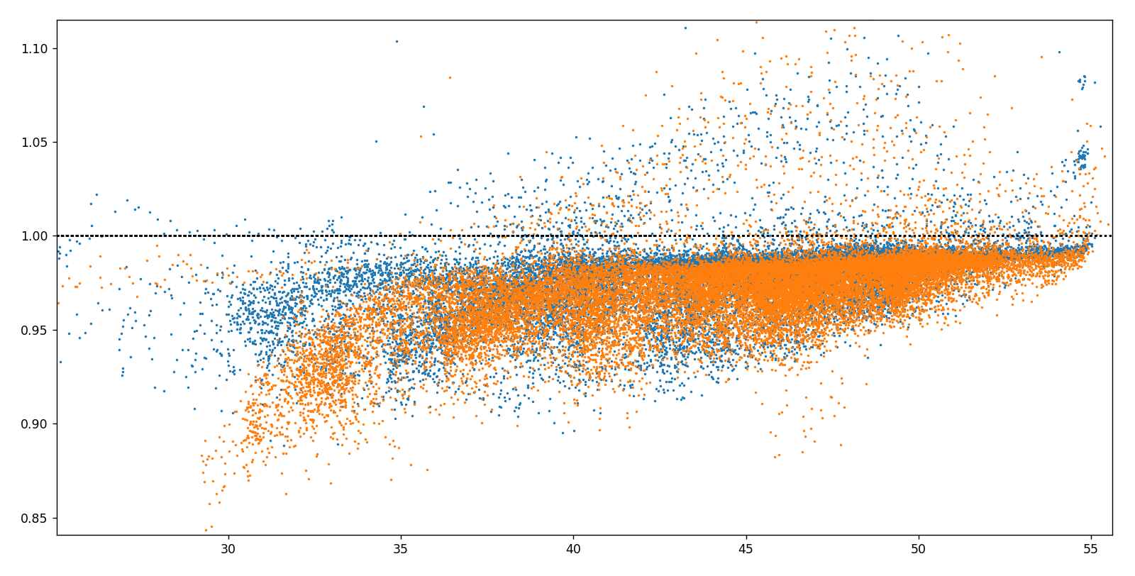
I’ve gotten too irritated at RaceStudio3 not doing basic things, so I am embarking on just writing some Python code to do my data analysis. The long-term goal is to automate all the repetitious stuff, but I am starting with this clutch analysis. Here is my first sweep at reading in the clutch slip and plotting it. Orange is my second-to-last practice day, and blue is with fresh shoes, swapped to leading position, and white springs:
There’s a couple standout features (and a bunch I am still noodling through). The biggest change is in the 30-35mph region. This is exiting a tight hairpin, and you can see the new clutch is far more engaged. Butt dyno confirmed that the pull out of the turn was a huge improvement with the new shoes. Not bad - $40 for 10% more power!
At higher speeds, you can see that the blue dots get much closer to 1:1 than the orange dots did. Both don’t get to exactly 1:1, but that is more a reflection of how I define the gear ratio for the slip calc. I am assuming this error is the same for both days though, so I think it is valid to say the improvement for the blue day is real here as well.
With less slip was there a difference in lap time and could you see the improvement in the data? The lap time is probably useless because the track changes during the day but the data might provide more insight.
The short answer is that I haven’t gotten that far yet.
The longer answer is that both sessions were with another friend who is slightly faster. Exiting that tight turn, I could not gain on him the first day despite me having a larger rear gear by one tooth. After swapping shoes and springs, I could noticeably out-pull him out of that turn.
The problem with 206 acceleration data is that the acceleration is about as large as the noise around it. I am going to play with filters and try to see if I can get a concrete answer.
So… I really dove into the deep end on this one, and if you read to the end you’ll see why I haven’t had an update to this thread in two months, haha. The hard part with looking at 206 data is that the peak longitudinal acceleration is only around 0.2G when geared for 55mph. Steering input can scrub around half a G, and a slope of 10’ per 100’ is good enough for about a tenth of a G. Then there’s the wind; a headwind of 10mph vs. a tailwind can show up as a huge variation in accel data.
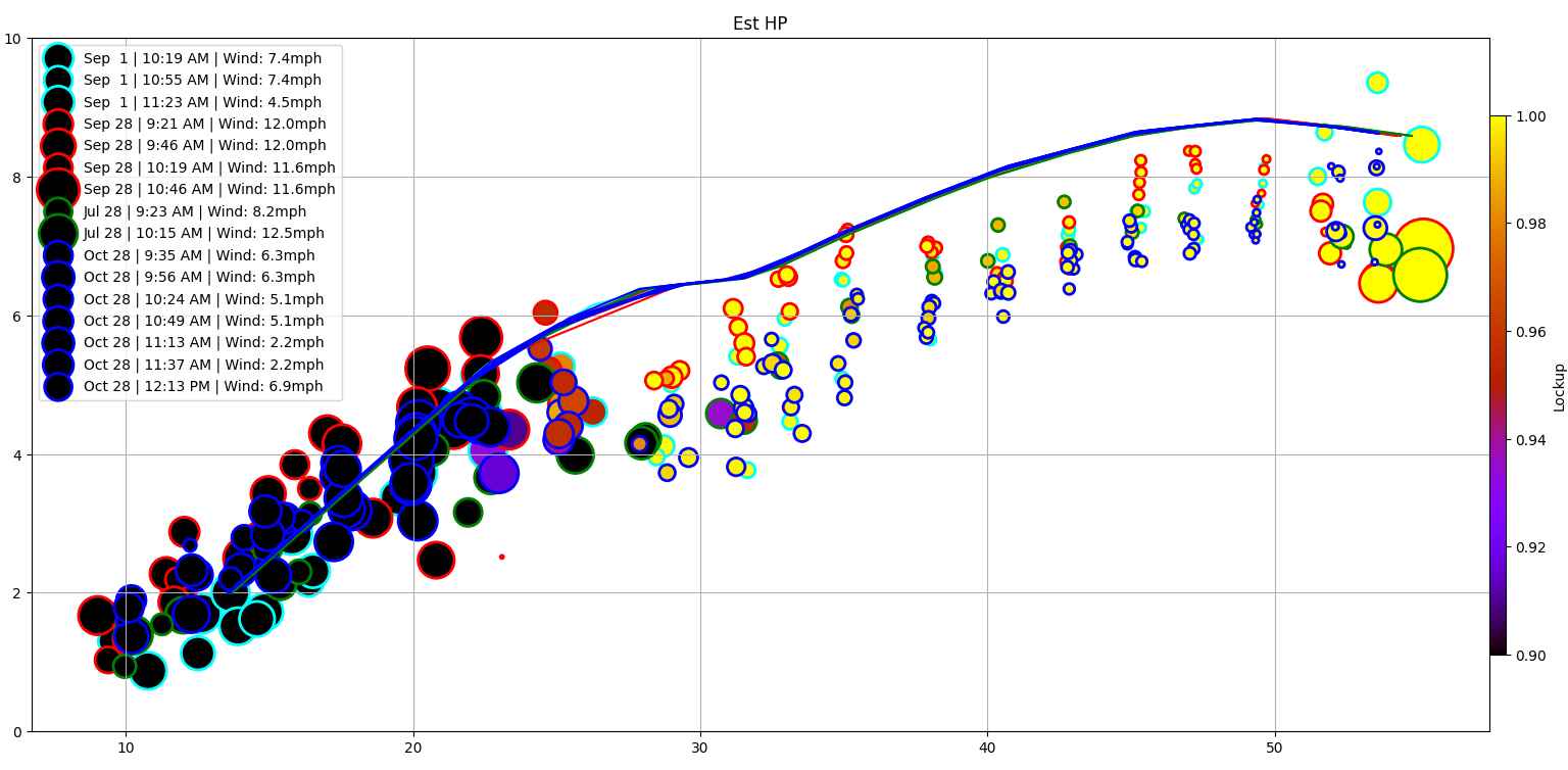
I ended up writing a really neat Python script that automates all my data processing, so I can create a PDF summarizing my day and then just print that out and put it in my notebook for later reference. One part of that now is creating this plot of power vs. speed. I intentionally did not plot against RPM, because that depends on gearing and clutch slip. By plotting against speed, I can see which gear ratio and/or clutch configuration gives best acceleration at difference speeds.
The overall process for this plot is to trim the data points to where I don’t have much steering input and where it is accelerating forward but not too much (because that would be a bump draft). Slope doesn’t seem to make much difference, and the Mychron altitude data is absolute garbage (it can show hundreds of feet of difference at the start/finish line as a session goes on), so I ignore it for now. I can ping google to find the altitude points, but I don’t think it is worth it yet. I did find a huge difference though when pulling in weather data, specifically wind speed and direction. I think it is really neat having an automated tool to take the session time and data and coordinates and kick out all the major weather data.
Lastly, I group the data in different speed ranges (like 55mph +/-2.5mph) then plot the median result. The size of the dot is representative of the scatter (st. dev), so a big circle means a lot of scattered data. The color of each dot shows the clutch slip, so the idea is to be able to suss out how much slip is best. The outlines are colored by what day the data was from, but I can also set it up so each session gets a different color. The solid lines are what Briggs says the engine should be able to do. What stands out here? Well, I am wayyyyy below this line just about everywhere. This motivated me to dig into my carb since I have been running it how I got it from the previous owner.
The needle height was set too lean, the exhaust gasket had been totally obliterated, and the carb alignment was off. I have also now replaced the air filter and spark plug for good measure, so I am very curious to see what happens to the data next time I had out. I also want to institute an SAE correction factor since I have all the ambient data I need to do it.
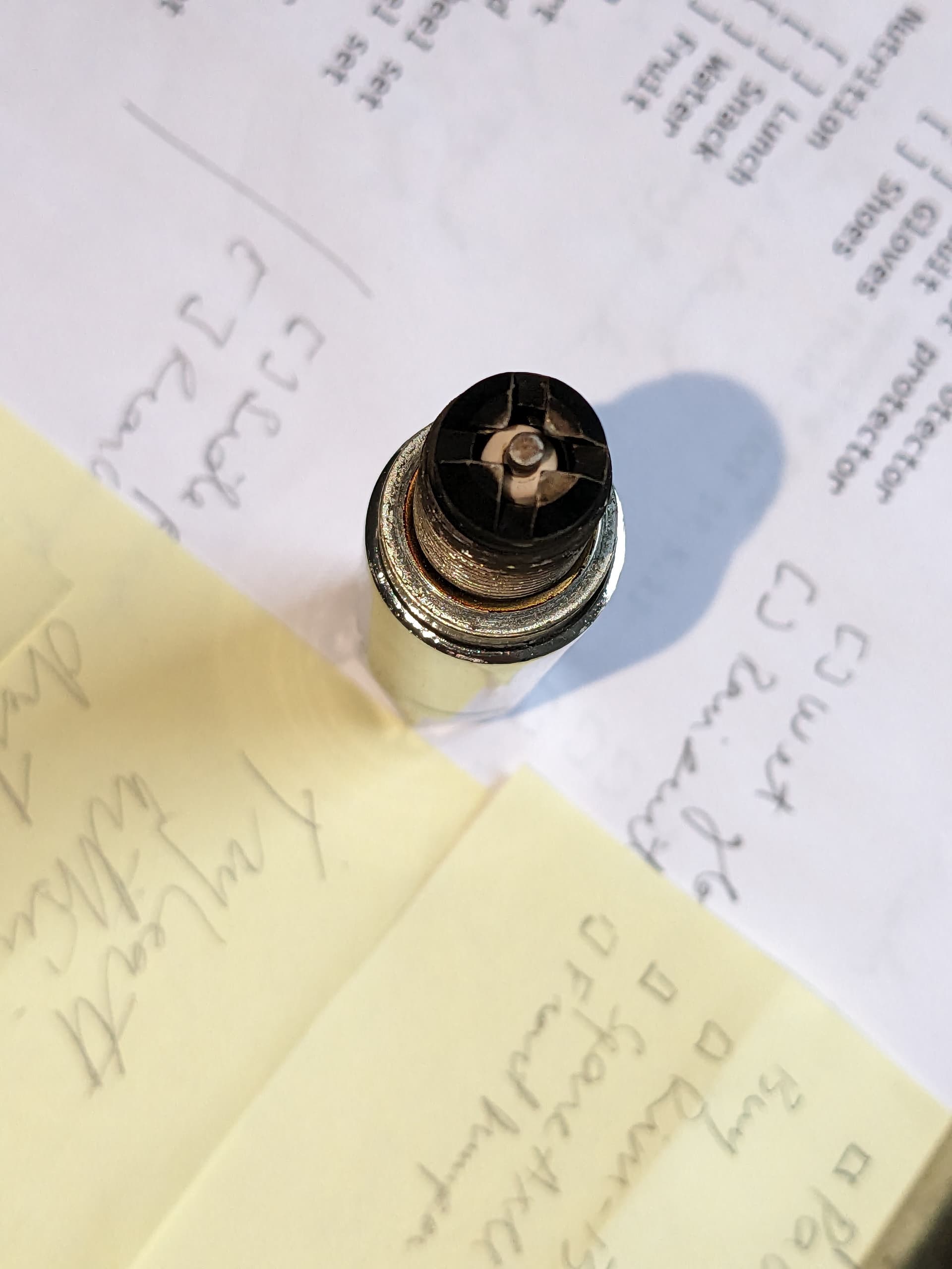
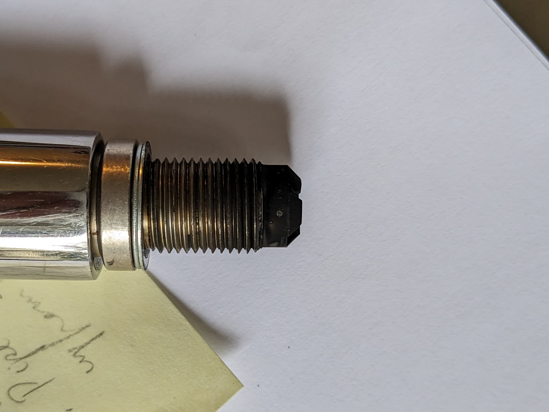
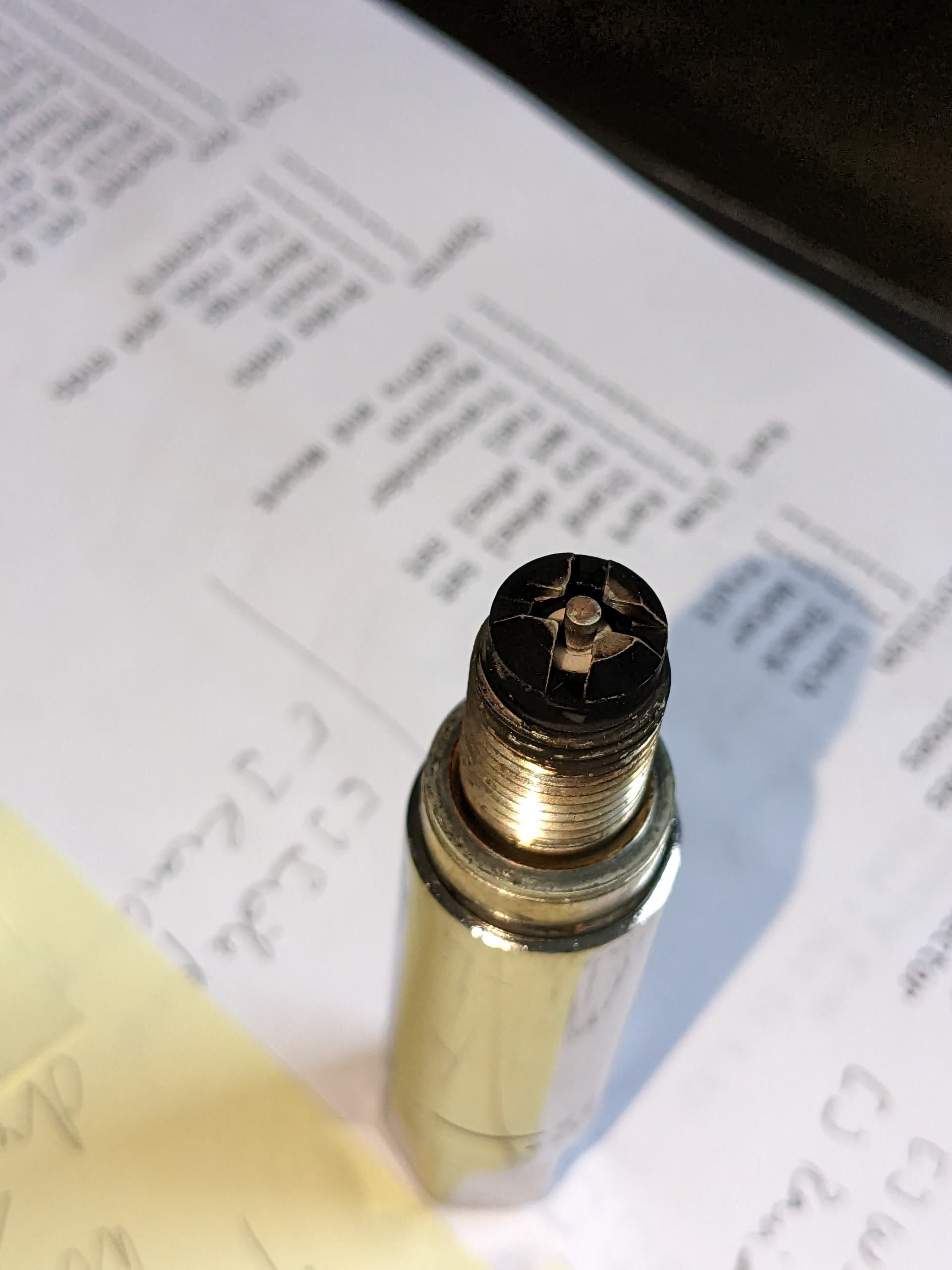
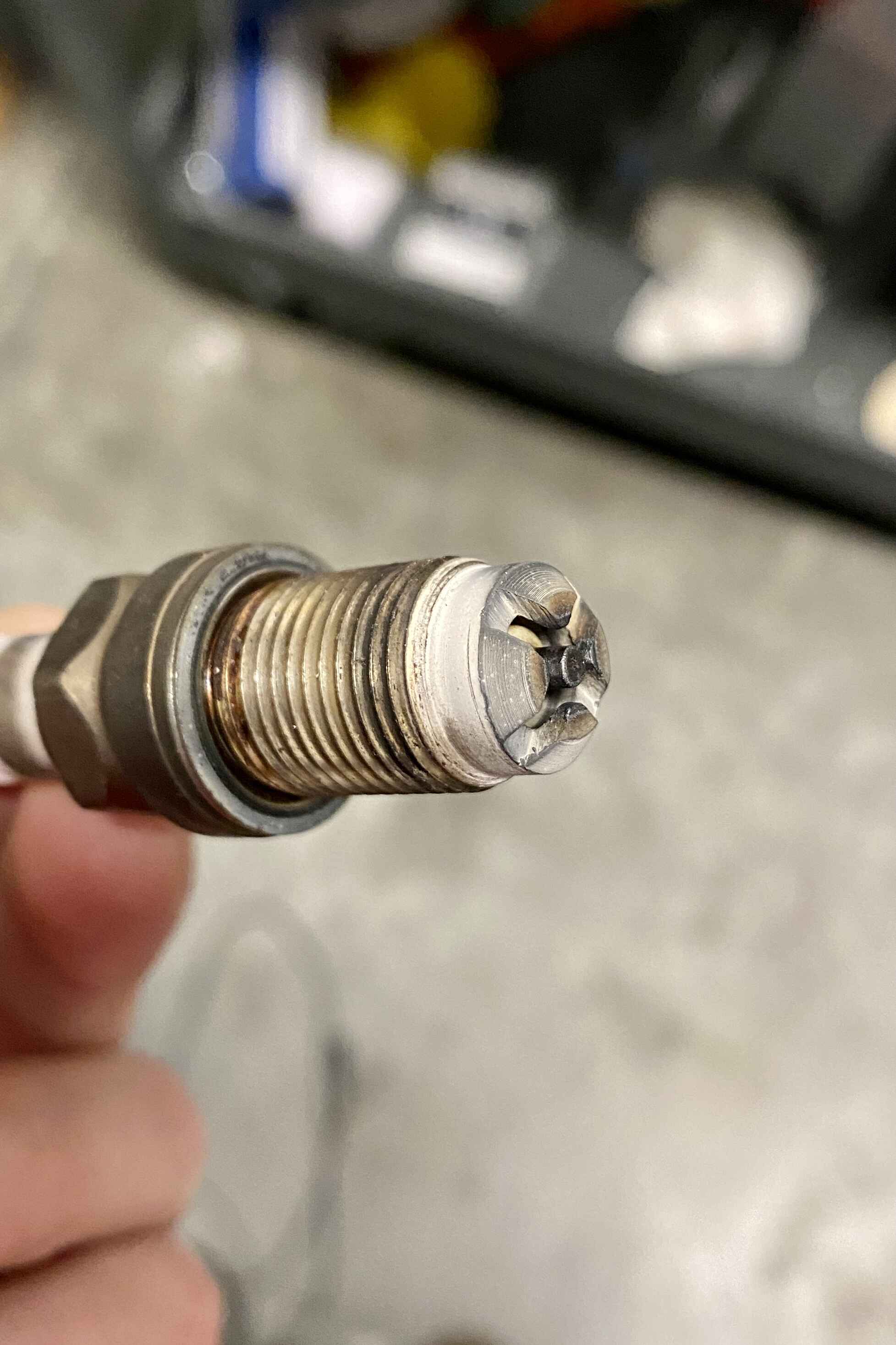
The big dip at 40mph was the first clue, needle clip height was in position 2 was the second clue, and spark plug was the third. I strangely can’t find lot of images of the 206 plug, but my guess is mine it too white / light tan. Obviously, there are confounding things like running on the limiter and idling in the pits that make it hard to really read, the rest of the settings and the data all point to being too lean in the midrange.
My brother, who has a lot of experience with cars said it looked fine.
Initially, I used regular 87 octane gas from Costco. I then switched to ethanol free and IIRC, it was 92 octane - that was the only octane level they had. TBH, for all I know the Costco has was ethanol free, too.
That looks a little on the rich side, but it seems that’s how the Briggs should be run. I’ll defer to others though since I’ve never been great with reading plugs. This is what mine looked like though
It depends greatly on loaded vs unloaded operation. If you let the engine idle on the grid or on the stand for extended periods it will tend to soot up more, regardless of the tune. Unless your altitude density varies wildly, carb float and needle can often be left alone. Try playing around with a float height on the higher side (smaller number) and a needle on the lean side, you might like the results.
We played around with the tuning on these things for a year and a half and found that clutch maintenance and valve sealing did make a difference that my son could feel on track. Clutch maintenance was most impactful on starts, sometimes on very slow corners if it dropped out of engagement, otherwise the goal is to keep it locked up all the time. Valve maintenance made a major impact on the overall performance of the motor and ability to hit top end easily. With my son being 6-4 and making a big hole in the air he could tell when the motor was off just a little. I would say he picked up on it more than most.
End of the day, getting the chassis right and driver in a good head space was worth way more time on track than any of the above. Trying to manage the high grip hop of an OTK with a tall driver without compromising front end grip too much has been an ongoing challenge in the 206 for us.
And yeah, this whole endeavor started as a way to qualify the clutch and see when it needs maintenance. There’s one turn where it flirts with the engagement range, and I was hoping to see if there’s an objective way to evaluate it.