I put the following website together for Italo at Urace.us. If you have a few minutes let me know what you think. It still needs some tweaking but I have looked at it so many times, it would be great to have an objective extra set of eyes look at it.
Off the cuff the aesthetic is good and modern. I looked just now on iOS15 on an iPhone 12.
Some things are general UI/UX, others are conversion optimization.
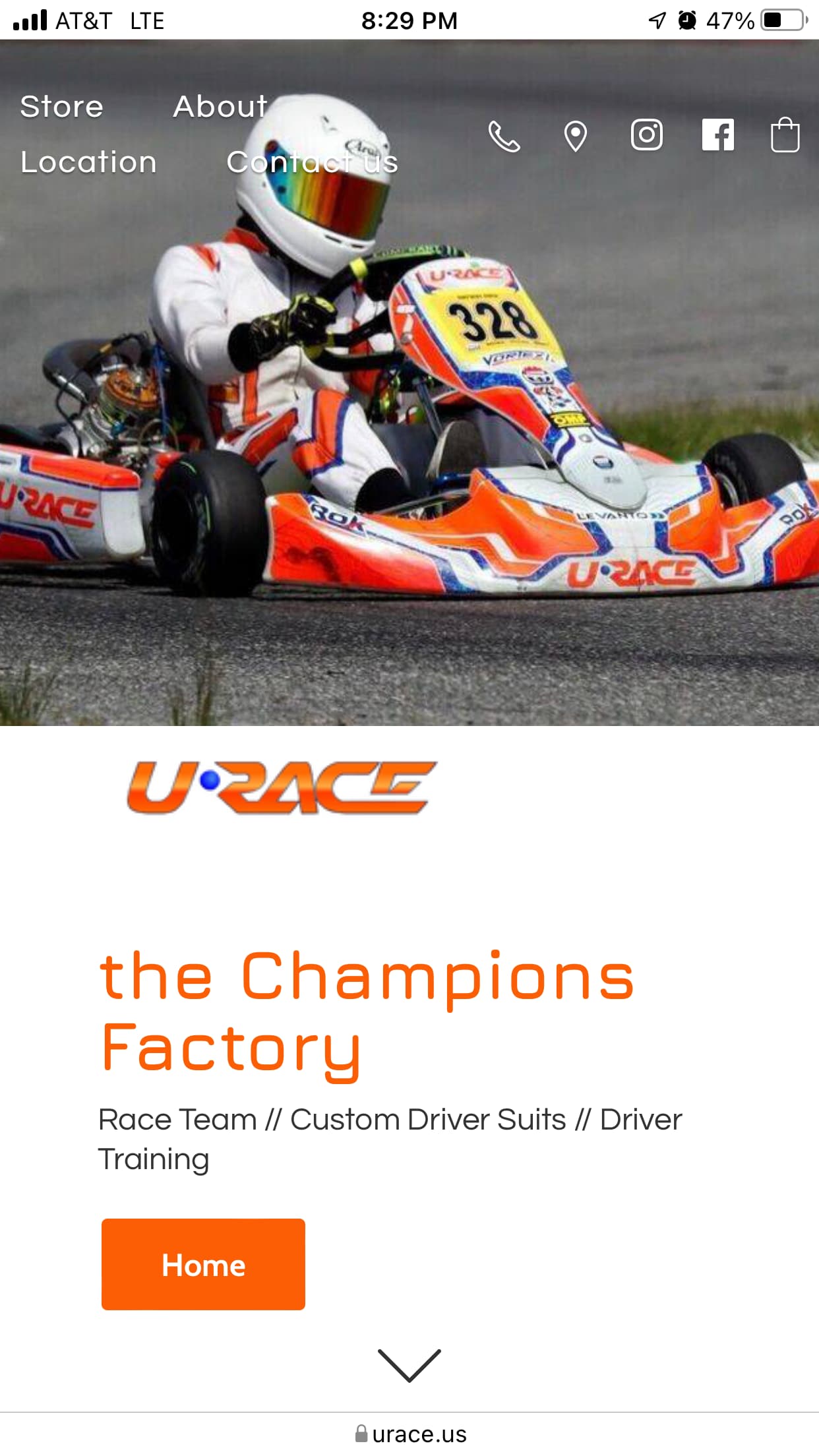
Landing page:
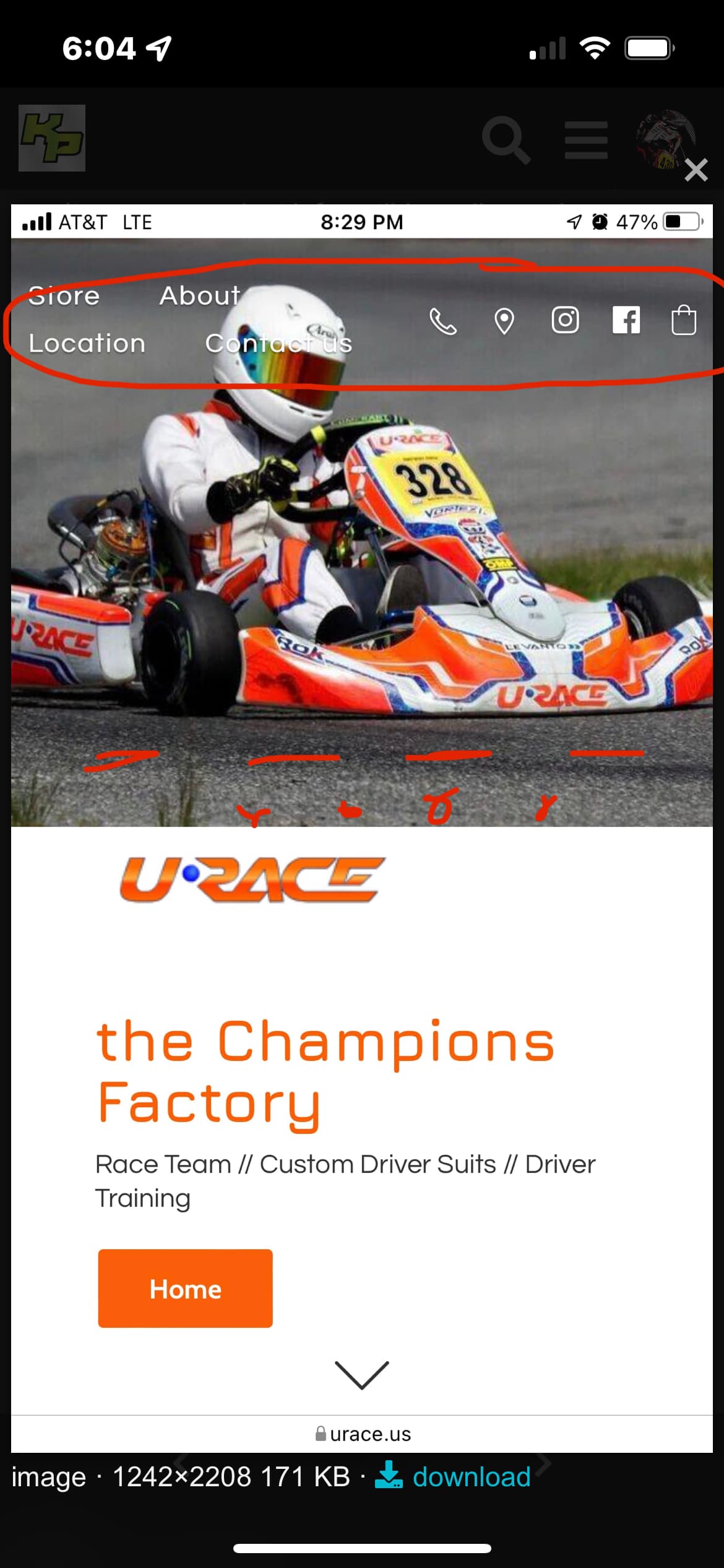
I’d drop the header image, or make it dramatically smaller. Doesn’t add value and probably doesn’t increase conversion rate. All it does is push things below the fold and obscure the menu item font, detracting from its readability.
Who is the site for and why are they here? That’s probably what you want to address in the area where the banner image is. It needs to be pretty specific, so scratch the surface and communicate a UVP here.
Speaking of below and above the fold…… get the search icon moved up way up.
Testimonials are a good touch, those you can afford to make those horizontal scrolling to claim back some valuable vertical space.
Product page:
Maybe the person already knows what they are buying here. If not, looking at the corporate event, i have no idea what I am buying or why I should care until I scroll a lonnng way down. Again, get a value prop up front, above ybe fold.
I’d probably remove categories from the product pages, I’m a big proponent of having a category breadcrumb however.
Also the elements are a bit out of order IMO on the product page. There’s really no content that’s going to help with conversion above the fold here. Remover and or compress the website-wide elements vertically I can’t see any product info until I scroll way down. Arguably looks broken on my phone as the page presented doesn’t (yet) relate to what I just clicked (the product link)
You’re getting the email at just the right time there, hopefully there’s some abandoned cart logic behind that? Looks like it’s not asking for create an account BS, which IMO is the way to go combined with getting the email at checkout and having an abandoned cart process.
Paul…I will start that I know very little about web design but some things I notice:
It appears that the entire contents are all on the front / main page and the links at the top of the page just move the page down, vs bringing you to another page / area. I have seen sites like this and in my head this seems confusing as traditionally a link brings you to a new area.
Kind of in the same vein. The HOME button moving the page slightly is confusing as really I’m already on the home page, but handy when on other pages.
Is t in the Champions Factory intentionally not capitalized?
Looking at the ordering process for suits. There are some quirks. Each pull-down shows “brake”. I would like to see actual examples pictured, especially the basic Formula A. It appears this is a simple 1 color suit but the picture is much fancier. As for the color referencing the PMS colors might be over most people’s heads. Maybe just offer a selection of colors in the pull-down.
I agree with the things said above, and I would also add a gallery of product images. The prices are quite low so with very few images I think some people may not trust it.
Testimonials and pictures would change it from “kinda sketchy” to “really good deal”
thanks again for all the help guys. I am making the changes this weekend based on your feedback. It requires some CSS work. Not too bad. I tell Ecwid (the e-commerce platform) what I want and they give me some code that I pull in.
Good point. I tried different number of columns, etc… but in mobile size format, it always puts the product description below the ordering process. I have some code coming to fix this.
Search icon up – yes, definitely
Testimonials – horizontal scroll. I like it. Let me see if Ecwid can do it.
Header image - you would not have liked what I originally had. I will play with this. I took out white space between the image and the category images. I will see if I can take out more
Point of the site - I put a couple of sentences in. Good point. Thanks
Categories - I think I will eventually need them once we build out more products and add more content but let me look at it.
On my Mac this didn’t happen but on my Chromebook each information box on the order form when I click on a information box with the word “brake” is displayed. It still allows me to enter the text I wish and once I do the box with the word brake disappears.
I would also suggest maybe an information video link of someone being measured might be helpful and decrease the chance of people taking incorrect measurements
Just thought I’d share some feedback on a hosting service Squarespace
I find the rates are very reasonable, they have a website creation section that’s super intuitive, loads of options. If you have a query or question, support comes back to you quickly. Website servers are fast.
Perhaps the thing I appreciate most is they handle your search engine optimization (SEO). In the settings panel there’s a section for SEO, you just put your tags in and leave them to it. I only put my site Kart-World KZ live like three days ago, already if you bing ‘karting nur sultan’ it’s the third hit. Google will take a bit longer because I only just realized it’s a separate activation but it’ll get there before I’m ready to open.