@chrisortenburger at Eynovation has unveiled the new look for the IKF.
What do you think?
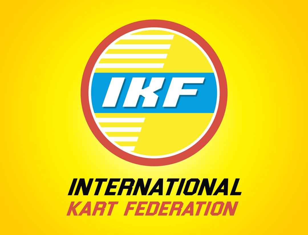
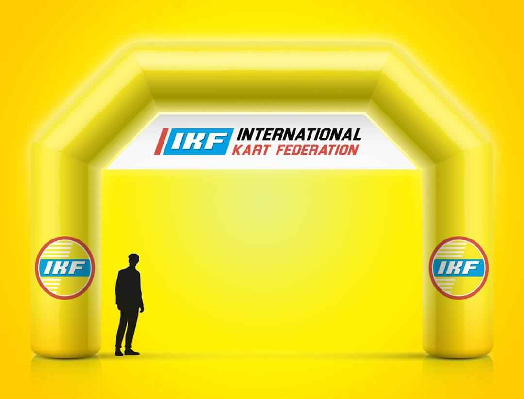
I dig it. Simple, clean. Stands out and modernizes the older look without completely throwing out the look of it’s legacy.
@chrisortenburger at Eynovation has unveiled the new look for the IKF.
What do you think?
I dig it. Simple, clean. Stands out and modernizes the older look without completely throwing out the look of it’s legacy.
A great modernization of an iconic brand. Well done @chrisortenburger!
It’s not bad. More consistent kearning would make it look more professional.
I like it, but what I really hope to see is a more effective karting organization. (Holding my breath on making a ‘lipstick on a pig’ comment.)
I really do like the design though. That’s neat.
I think there’s a good chance of it improving given its recent history (hard to get much worse on the visibility side) and the people involved with the rekindling of it.
It looks a bit retro to me, TBH. I like the yellow though.
Dear god,
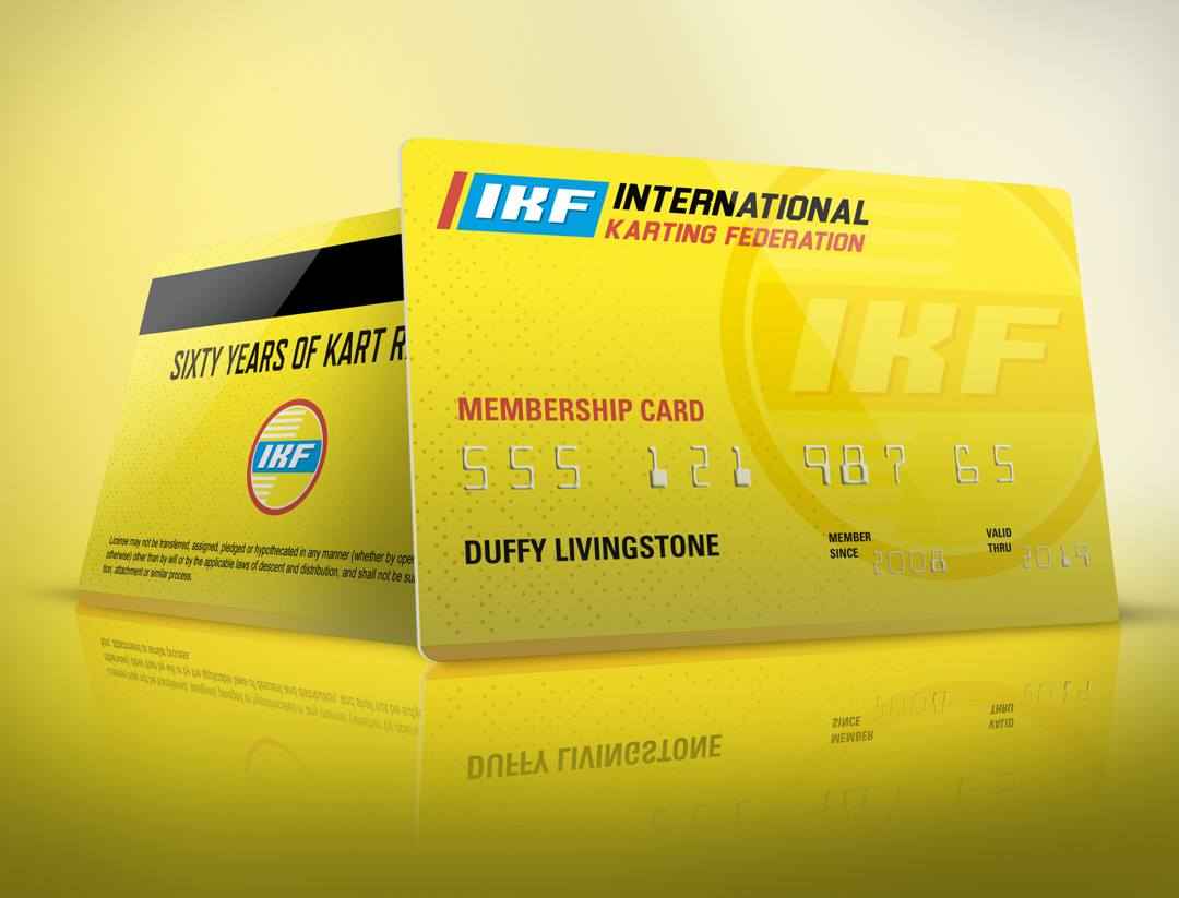
Can we have online membership registration and online payment? Why am I mailing a check like it is 1980?
Maybe a site design that doesn’t make you want to give up on life?
Thanks TJ. Huge compliment from you. You’re doing some amazing work yourself so the kind words mean a ton. Thanks again!
It was largely based off the old one. The point was to try and keep the retro feel and color spectrum. Appreciate the input. Cheers.
Here’s the latest on IKF: