So in the post about Kart Republic, @KartingIsLife talked about the colors of the brand. That made me think, what makes a good kart branding.
Obviously design plays a huge roll in how people see a kart, and it is a very opinionated characteristic. What some people see as good looking other people see as an eyesore.
There’s also different aspects of a kart livery. There’s color, which is one of the more straightforward ones. Personally, I dislike green and red for racing colors. There’s exceptions but its a very typical color for racing, and to me that makes them not that great to use. I like orange on a kart, to me that’s rarely seen on a lot of brands, or at least popular ones. Really anything bright will generally be positive to me. Karting is a fun sport, and having a bright color scheme makes it look more exciting.
There’s the actual design of the graphics as well. I think right now lots of teams will have many details in a kart and it can look very messy if not done well. I’ve found a liking to minimalist base designs. The Kart Republic is white with an offset stripe for the base design, and the winged logo is used for color on other parts of the kart. It looks clean, and not too busy. I won’t name a specific brand but some manufacturers have bright colors, but the way the design is laid out makes them hard to distinguish at speed and, to me, it looks a bit busy especially on the side pods.
I’m sure there’s other parts to a design that have an impact, but those were the first two that came to mind. Like I said, it’s a very opinion based topic so there will always be karts some people like but some don’t find nice at all
Most of the usual livery and general design principles apply… legibility, cohesive lines and angles, flow etc. The common issues I see when looking at other people’s kits is the lines don’t complement each other, there’s no established visual hierarchy, and most of them are simply too busy.
One of my instructors in school said this great quote: “Design without purpose is just decorating.” When you start just slapping on lines and fades to fill space or make it busy just for the sake of it, that’s decorating, not designing. Another good quote: “Design isn’t about what you include, it’s about what you leave out.”
Now, granted, livery design or product graphics are slightly different because mostly what you’re trying to do is convey a sense of speed or give the livery an overall feeling or mood of some kind.
The thing with karting liveries (and helmets) is that customers often see something they like, and they want that exact same thing. So when you see all these busy decal kits with the sharp points and fades and flicks, it’s because someone did that and now everyone sees it and likes it and wants the same thing. What most of the clients don’t realize (and it’s my job to explain this to them) is that by making your decal kit the exact same style as another because you think “it looks cool”, completely defeats the purpose of getting a custom design. Instead of standing out, you blend in.
This is why 80% of helmet paint jobs have the same “Euro” look, because people see it and like it and just want to get the same thing done, completely ignoring the fact that a custom designed piece should be personalized and unique.
I’ll finish by saying the KR graphics are pretty bad. The brush strokes are out-of-the-box effects, not a lot of effort there, the “wings” look like orange mustaches to me, the lines don’t match up across sections… It’s a shame because the logo is so nice and clean. The only good thing is it’s mostly white and the pops of orange help keep it bright and unique to the other liveries.
That’s actually really interesting stuff I’ve never thought about. I don’t think I’ll ever get into the design business except my own stuff, but the part about what you leave out is something I’ve never thought about but notice a lot.
I’ve thought the same thing about helmet designs a lot. There’s a lot of similar stuff and the interesting thing to think about then is that solid colors are a lot easier to pick out in a group. One of my favorite designers is Brett King because he uses solid colors and layering very well, you do it well too and helmets from the both of you are definitely distinctive vs. others I’ve seen.
I actually never noticed that about the brushstrokes on the Kart Republic graphics, but now it stands out to me a lot more. My thought was more their offset vertical line down the nose and fairing that I liked. Asymmetry isn’t used much so I like it when someone throws that into designs.
I do remember thinking the logo looked like a mustache when I was in Vegas. It took me a couple days to understand what it actually was.
I like a helmet to have an obvious design from distance and then extra details as you close in. Most helmets (the euro style ones) end up just being a mash of colors from a distance so you can tell who they are. I actually really like Vettels helmet at the moment, the defining distance design is white with german flag stripe. Then when you get close he’s got all these details (and different details every race).
The same could (or maybe should) apply to kart graphics. But like you say most of them look the same these days.
What Makes a Good Kart Livery? I haven’t thought about it until now, but with cars, my subjective answer would be “Complimentary colors and lines that can tell a story if someone stares at it long enough.” I think it’s possible to have a similar approach for a kart.
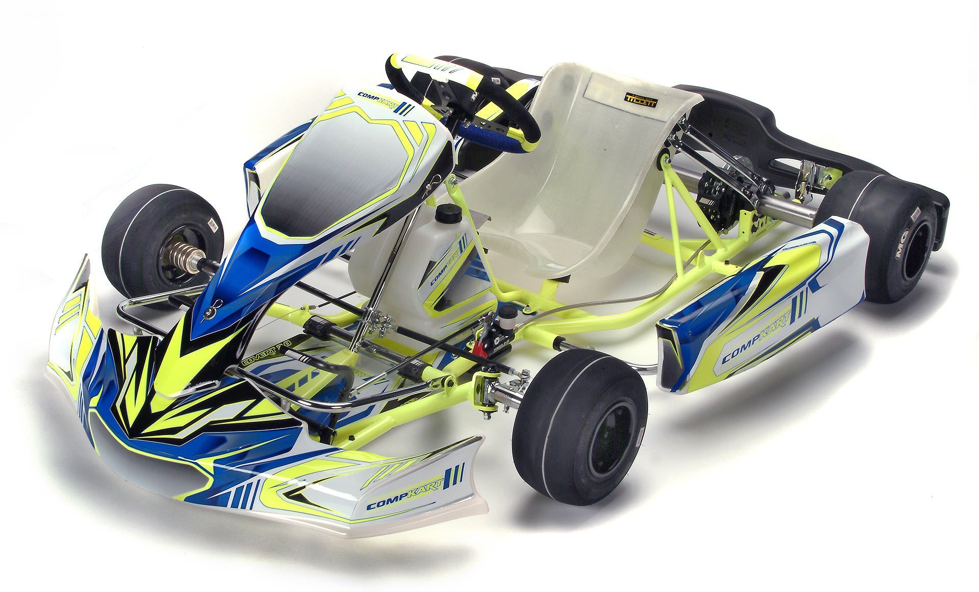
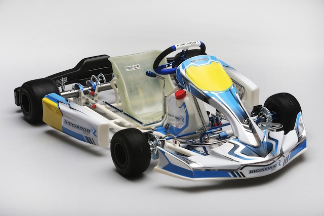
That said, my personal preference is always to opt for minimalistic design. I’m currently in a sort of all white base, with a specific logo or brand as the central theme. I’m drawn to the Compkart 4r as my next kart, but the bright chassis color is actually a negative for me. Would much prefer white or grey.
Between these 2 with similar designs, I prefer the dull while Ricciardo over the bright highlighter yellow Compkart, as well as the soft curves over the aggressive lines up front. I take it @Aaron_Hachmeister_13, the bright color speaks to you!
You’re right! I love the fluorescent color they use. I would rather they either use more of the blue though, the fluorescent yellow on white doesn’t come out as well as when they use it on a blue, but both designs look pretty nice.
Interesting comments above. A lot of modern karting graphics are quite busy. It’s cool, but there are some lost to history that are also great.
Some of my favorites (always personal preference):
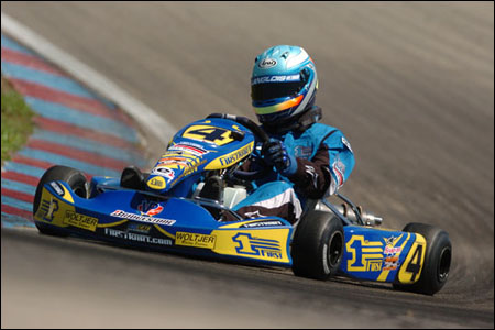
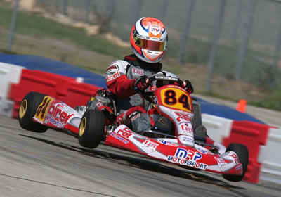
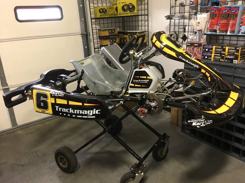
Brendan Langlois and the 1st kart, a nice combination. Track Magic always had prime graphics, and the swansong version was arguably the coolest, with a throwback approach. This color inversion modern graphic version is even better. Lastly, the “MRP era” Birel graphics were always good looking.
Good choices Eric, I like all those as well. The First Kart one was always one of my favorites. Unfortunately I spent most of my time look at the rear bumper of Langlois…