Hey everyone, I figured I might as well start getting some input on a side project I’ve been working on. Long story short, I think my real hobby is data/over-thinking, and I just happen to use a go-kart as the vessel. I wanted to create an automated tool that takes as little user input as necessary and kicks out a breakdown of what most of us probably look at when it comes to data. The PDF format is great for comparing results since you can flip through the pages quickly or flip between multiple PDFs. I also print them out and keep them in my setup binder for reference later without having to grab a laptop.
User Inputs:
- list of CSV files from Racestudio3 (I’m trying to get XRV files to work directly and have a way to do it, but I haven’t gotten it to work yet. I haven’t tried Alfano data yet)
- Kart weight for power calculation
- Reference hp and rpm if available
- Which laps to look at (best lap, best n laps, or laps #n)
- Which parameters to look at like rpm, speed, lateral Gs, etc.
- Lap segments defined from lap fractions (so like 0.2, 0.5, and 0.7)
- Color map schemes
- Variable selections
Once the defaults are set, running a new breakdown is just a matter of pointing it to the right files.
Full PDF linked at the end, but here are some screenshots:
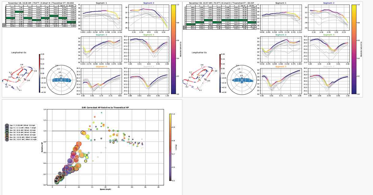
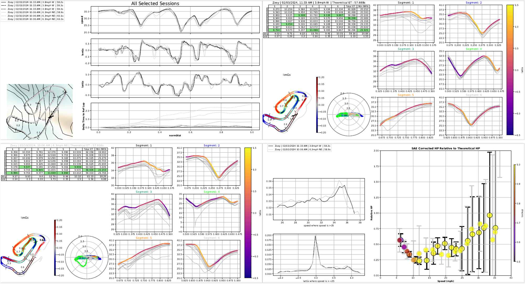
First Page (Summary):
- Date and time from each selection session
- calculated lap times for which laps are picked
- Wind speed and direction. All weather data is pulled automatically using the weather station nearest to the start/finish line during the session. This is used for the SAE correction factor as well, so there’s no requirement to log and enter the weather during the test
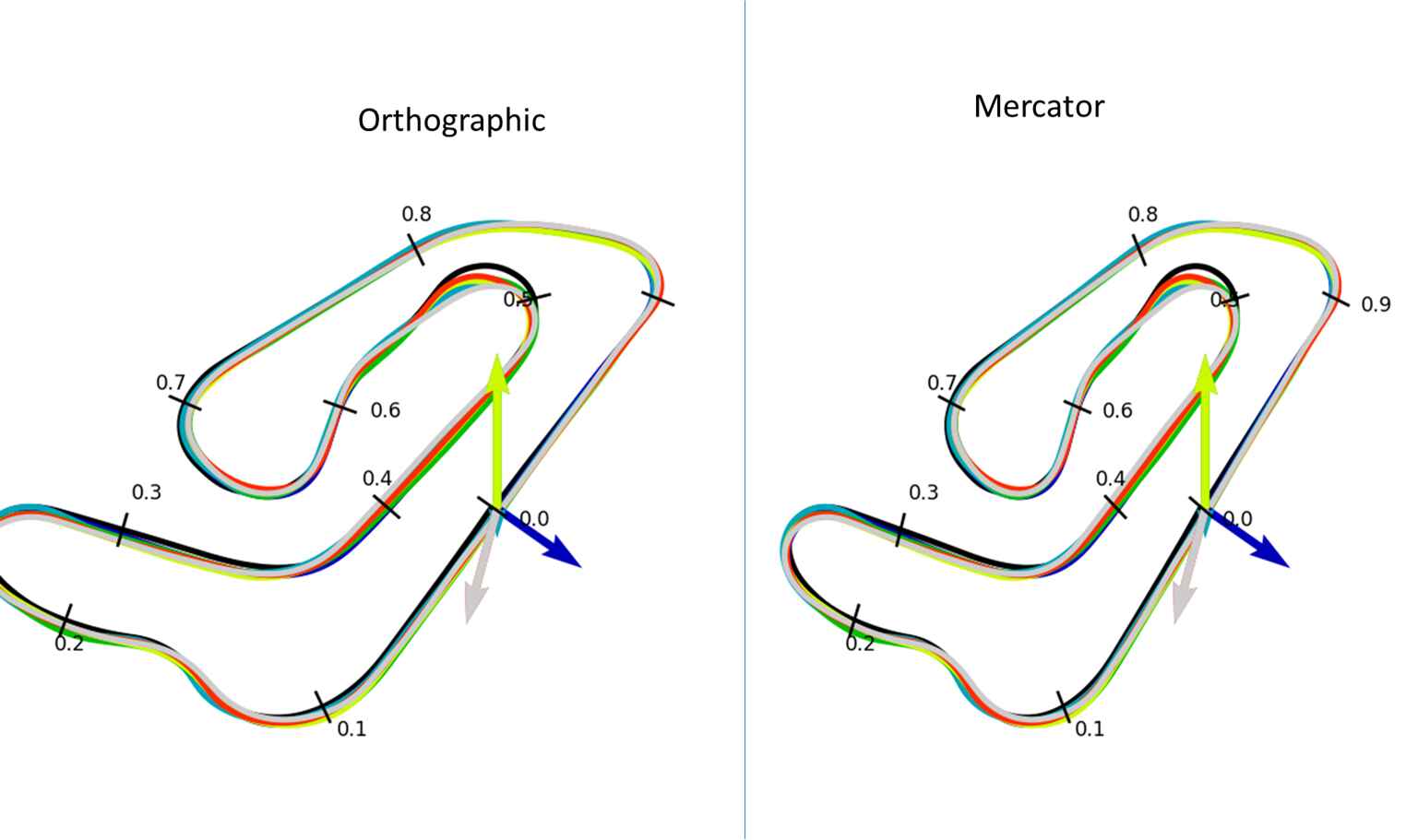
- Track paths for each session and marks for lap fractions
- Data grid showing plots of the selected variables. The DPI is very high, so you can actually zoom pretty nicely on either the phone or Adobe
Next Pages (Session Breakdown):
- Creates a table of segment times, total lap time, theoretical (sum of bests), and min speed. With Briggs 206, there’s not much point in doing a max speed, but I still want to add that for other classes that aren’t rev limited like my daughter’s Kid Kart. It also shows average for each column and standard deviation, and the title of the table includes weather conditions I pulled from the data coordinates and time.
- Track diagram is colored by a user-selected variable. In this case, longitudinal Gs so I can see braking points, max forward acceleration, stuff like that. It also has a colored dot showing the start of each segment and 0.1 increment hash marks for normalized distance.
- G circle. Pretty self-explanatory.
- Segment-wise breakdowns. This shows the speed in mph colored by the absolute value of lateral Gs.
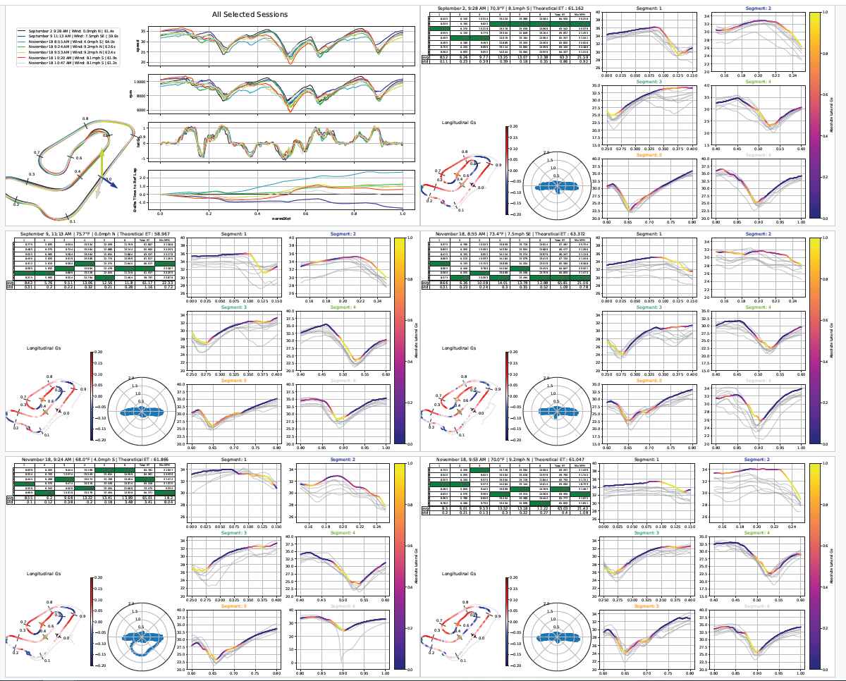
Last Page (Powertrain summary):
- This is actually what started this whole mess. I wanted to see if I could quantify clutch changes. I appreciate the sentiment behind “the stopwatch doesn’t lie”, but it also doesn’t tell the full story. It is more like the fable of the five blind men describing an elephant, so I wanted something that could rule out as many external factors as possible, including the driver.
- I also chose to plot by speed instead of rpm, so you can try gearing changes and see how it changes performance at different kart speeds. At lower rpm where the clutch may be slipping, power vs. rpm doesn’t make much sense since the rpm are not proportional to speed while it slips.
- I show wind on this page because I have found strong headwinds to really show up in the data for 206. Under the hood, I am using total airspeed for the drag calculation, so headwinds and tailwinds are accounted for. I haven’t yet, but I guess I could also pull in air density for how it plays with drag.
- The outline of each dot shows what session it is from, the fill color shows how much clutch slip is calculated, and the size of the circle reflects the uncertainty (big circle = lots of noise/spread). I divide the power I calculate by what the reference power is, so 1 is expected, higher than 1 is better than expected, and lower than one is bad. This is all corrected by an assumed drivetrain loss, humidity, temperature, and pressure, so I am more than a bit bummed by my results. Either my math is wrong or my engine sucks or something is robbing power. For the example here, I am using my daughter’s data, and I don’t have her dyno plot. I used to, but I misplaced it apparently… Since I don’t have a reference, it actually just shows the calculated power. I need to update the description of the plot better.
Bottom Line:
- There are a couple bugs and features I am working through, but for the most part, it works pretty well for my specific use. I want to work on expanding that though and making it flexible for other tracks and classes. I have played with my daughter’s KK data, but otherwise I haven’t pushed it much outside of GoPro and us two.
- A few little things like formatting, placement of different things, fonts, etc
- I’d love to get input on what people think. I see potential for some mutual backscratching - if you have data files you don’t mind me seeing, I’d love to try to break my script and validate my math. Especially if you have dyno + track data, I can really confirm or correct my power calculation. I don’t have to know anything about the setup you ran other than the total weight since I pull the rest of what I need from the data. In turn, you get a PDF of everything. I’m still on the fence about showing the script itself since it lacks a tremendous amount of polish, but I might once I get a GUI to work. That’ll take a while though since I have to learn how to do that first…
- Adobe PDF reader is far better than Foxit. Foxit does not cache the data, it seems, so each time you change pages it has to redraw. There’s a lot to draw here, so that got annoying fast. Adobe caches everything up front a lot better, so once it draws all the pages, they flip back and forth instantly. I have not tried other readers, so I am curious how others work, especially on Linux or Unix or Android. iPhone seems to work well, I just wish it didn’t scroll continuously across pages. iPhone didn’t display the same as Adobe at first, so I fixed some things. I’m curious how it works for other people.
Here’s the PDF itself, so feel free to pull it down and let me know how well it works or not. I figure y’all will be kinder if I show a 5yo’s data rather than my own, haha. I am very happy with how this is turning out, but I’d appreciate any constructive criticism from fresh eyes, especially since everyone attacks data from different angles, and this might be missing some obvious things to others.
Summary.pdf (2.5 MB)