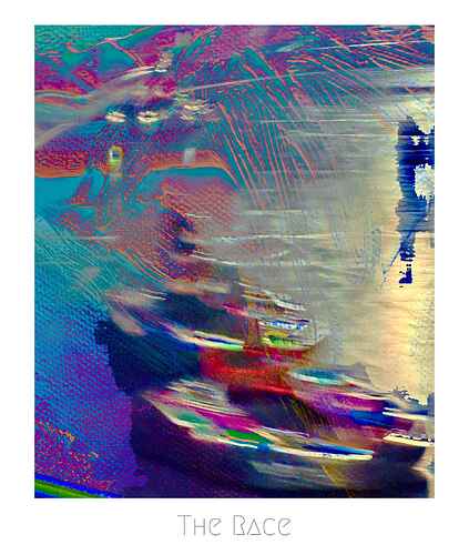
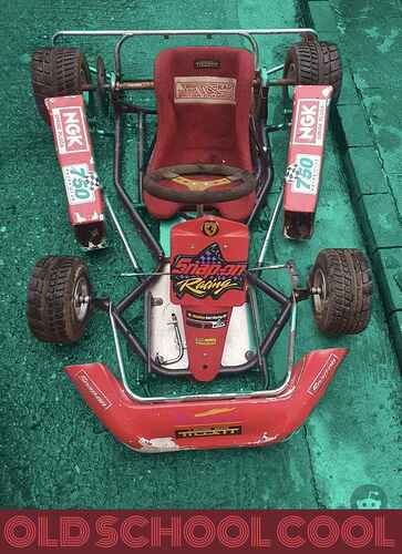
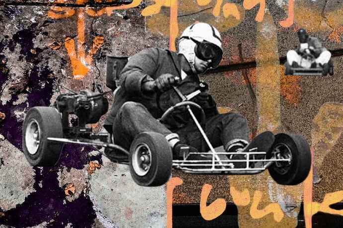
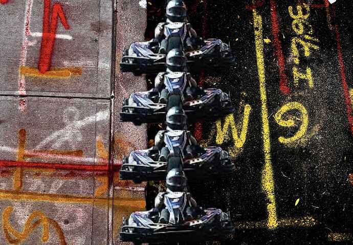
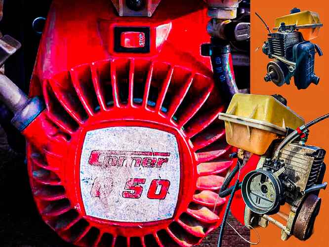
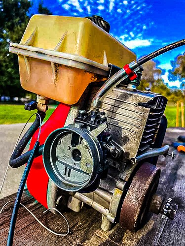
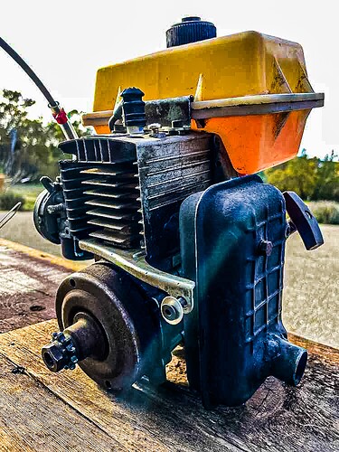
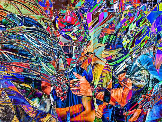
I’m loving this poster. I wonder if they’ll sell nice prints. Please?
I dont know where else to put this so I’ll make it artistic. I found this to be funny. I log into Youtube and here’s the content they are suggesting. They know me well:
I have found a way to make my current photography topical. Stick karts in the pics. So I present Manhattan street scenes with karting combined.
Aha forgot about this thread…
Here’s a racing “carte de visite” I made for fun for some friends who are Longshoremen (but a more modern iteration that use big machines rather than hooks to unload ships)…
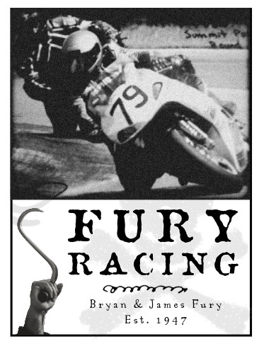
Also Bryan lied about older brother Jim’s age to make him older and annoy him.
While we at it, here’s a Google album of my “artsy” GRX photos:
2016 called they want their stickers back ![]() sticker bombing should definitely make a comeback
sticker bombing should definitely make a comeback
It is indeed k(art)!
Can anyone articulate wtf he’s going on about but not actually saying? Way too many buzzwords.
What’s the advantage of this approach and disadvantages? Like in actual
relatable words?
Filed under art because I agree it’s a lovely chassis design and clearly he/they are passionate about it.
His spiel reminds me of this gem:
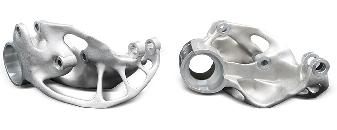
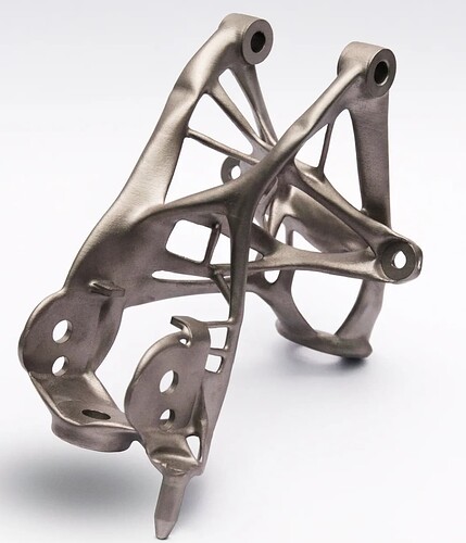
There are a couple of companies doing some of this. An example is taking a upper control and defining the inner mounting points and outer mounting point. Then use finite analysis to determine the material in between. The result may not be L or A frame we are used to but more of a stringy looking blob. The idea is material is only where stress analysis indicates it is needed. None is where material just adds weight. The result is very odd shapes that may be best built in 3D print because casting would be complex. It is kind of cool stuff. Some of the big car companies are starting to look at it. Here is an example of a suspension pieces.
Cool. It almost looks like bones. Spine, specifically.
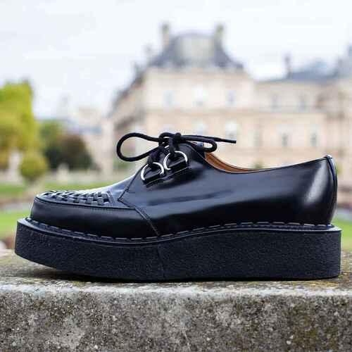
Also the shoes he’s wearing need to be examined more closely (a cyber era take on Creepers).
I agree. It will be interesting where it goes as metal printing and other high strength methods improve. You can see some skeletal features. The one on the right kind of says hip bone to me.
That said, most of the video seems BS. It does not seem like there are that many “organic” parts on that car
So basically we are making a car chassis that uses only the least amount of material necessary for the required usage and interestingly enough, the approach visually evokes organic life.
They should get Matthew McConaghey to do the promo stuff. With those shoes on. I definitely can’t afford the car and the shoes are probs a stretch, too.
I also have a problem with carbon ceramic disc brakes on street cars. Not sure why. Steel brembos have more soul somehow.
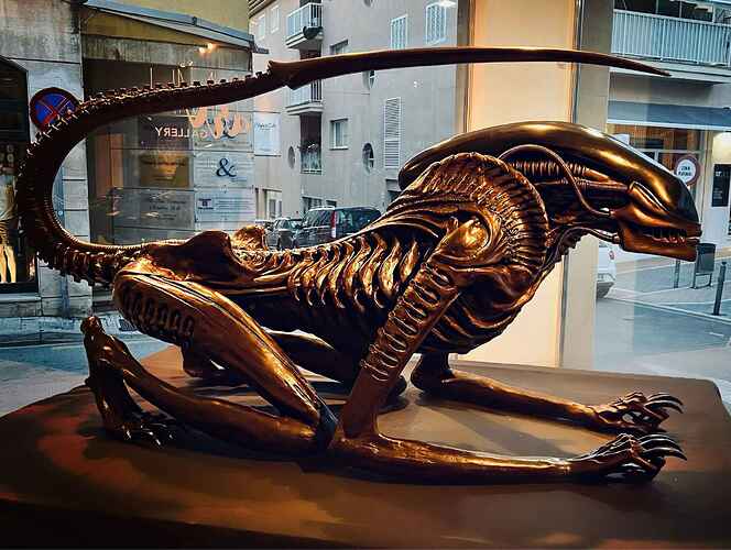
Hr Geiger art sorta reminds me of this.

