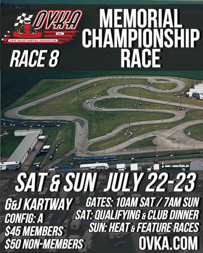
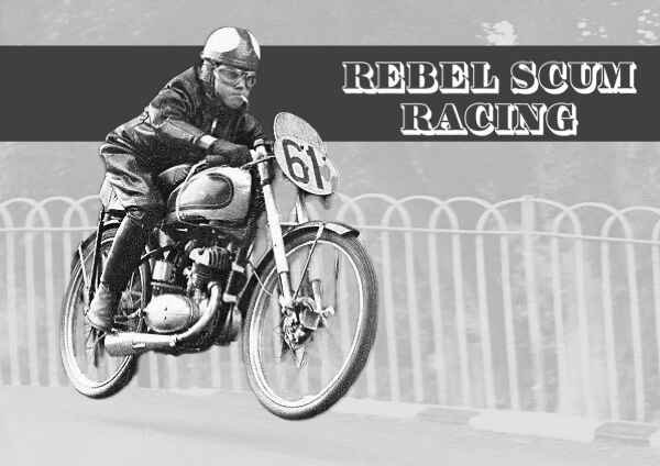
Race poster = kArt
Order another round of shirts in the next week or so. If they turn out decent I’ll send one your way!
Woot! Thank you. It will be like having a piece of Arizona in NJ.
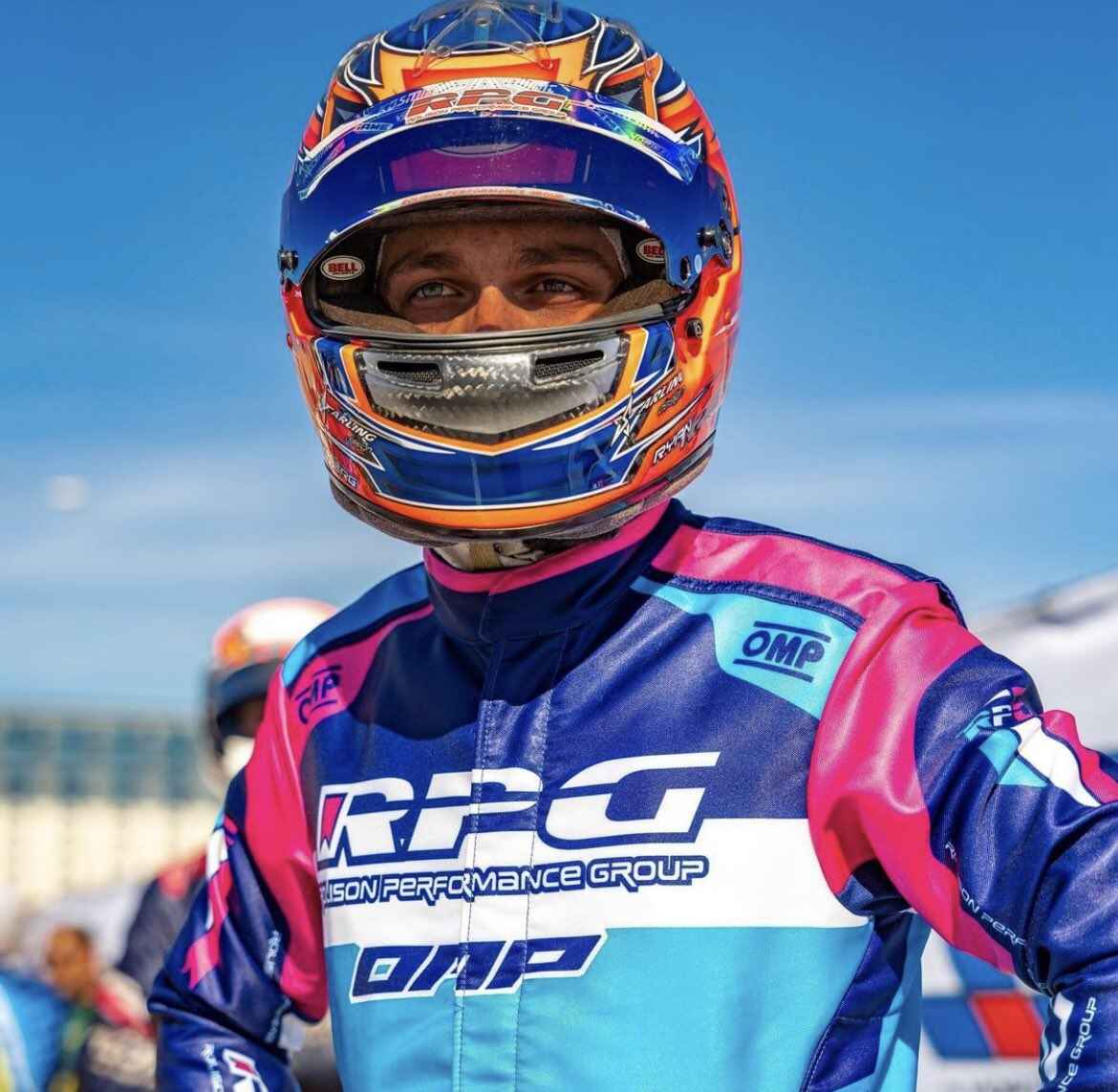
Great pic but oh no that helmet strap looks loose?
Hey Norberg Nation, what time is it?
It’s Ryan O’Clock
(Badum-tiss. Thanks I’ll be here all week. Try the veal.)
3 Likes

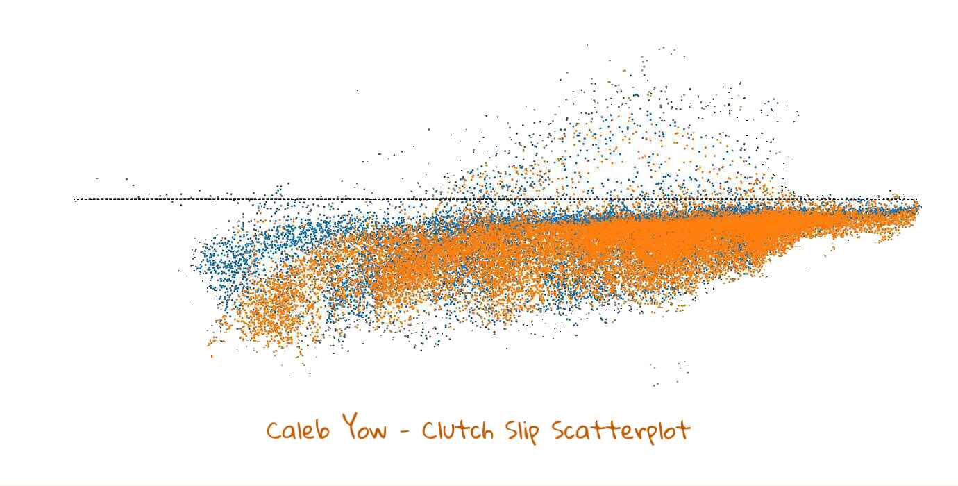
Art! (@dodo plot of clutch slip)
@Bimodal_Rocket Take that, Jackson Pollock! Haha
1 Like
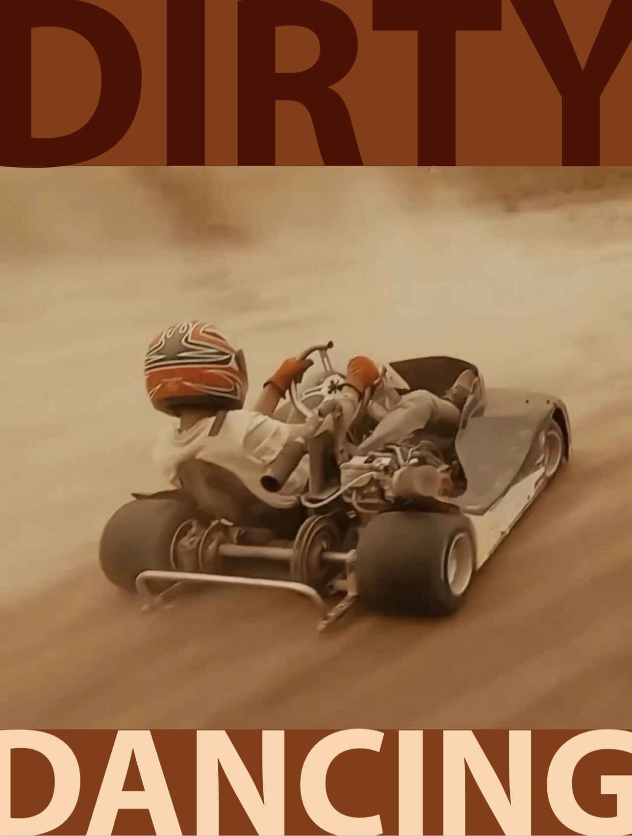
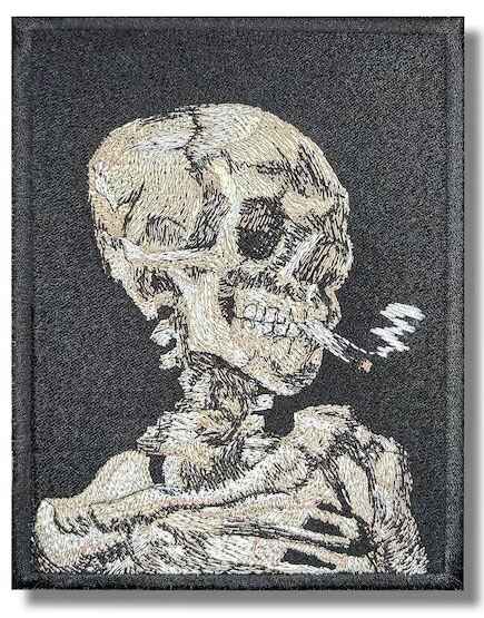
That’s a good one, this is the Isle of Man TT. I think his name was Harvey something about 15 years old. I like the cigarette in his mouth, good thing he has goggles on ![]()
2 Likes
Safety is important, doubly so at Isle of Man TT.
I hope it was a filtered cigarette for maximum safety potential.
1 Like
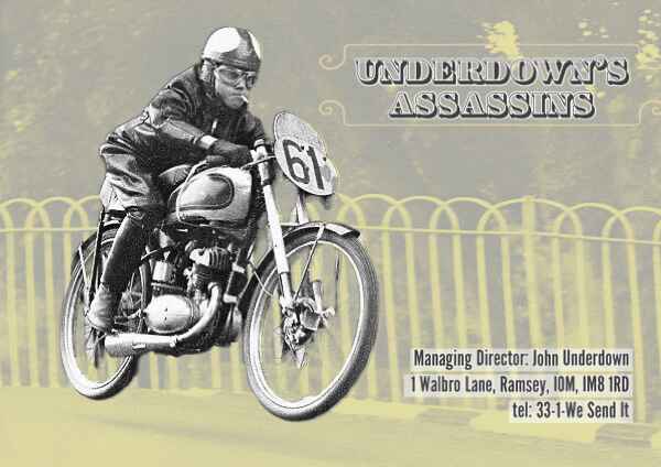
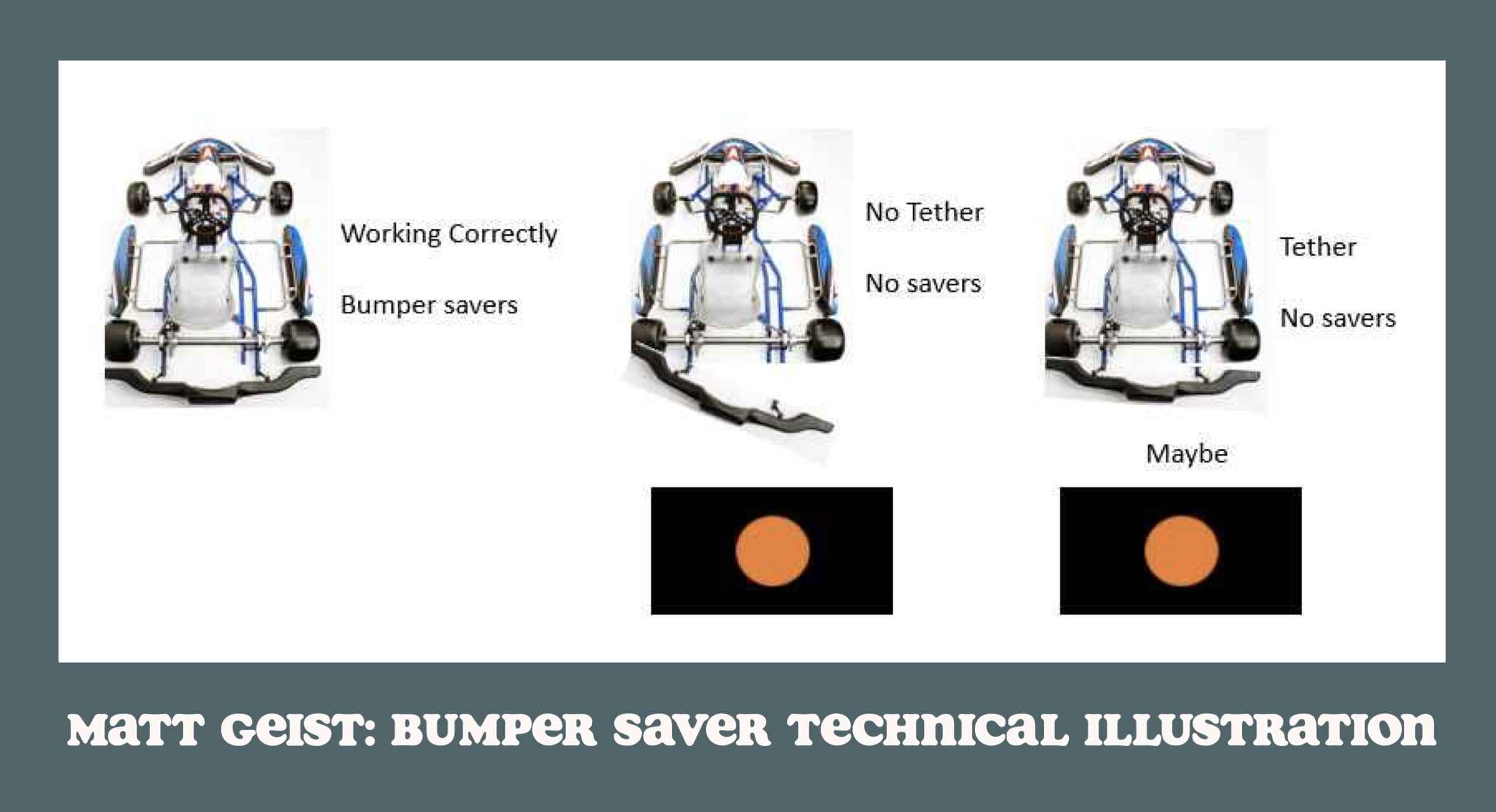
@johnu97 Lemme put your team in it:
1 Like
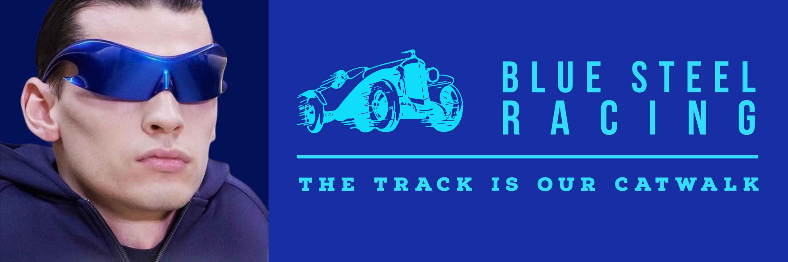
Homage to Zoolander inspired by shades that Andre is trying to get for Rebel Scum (without paying for but not involving strong-arm theft).
2 Likes
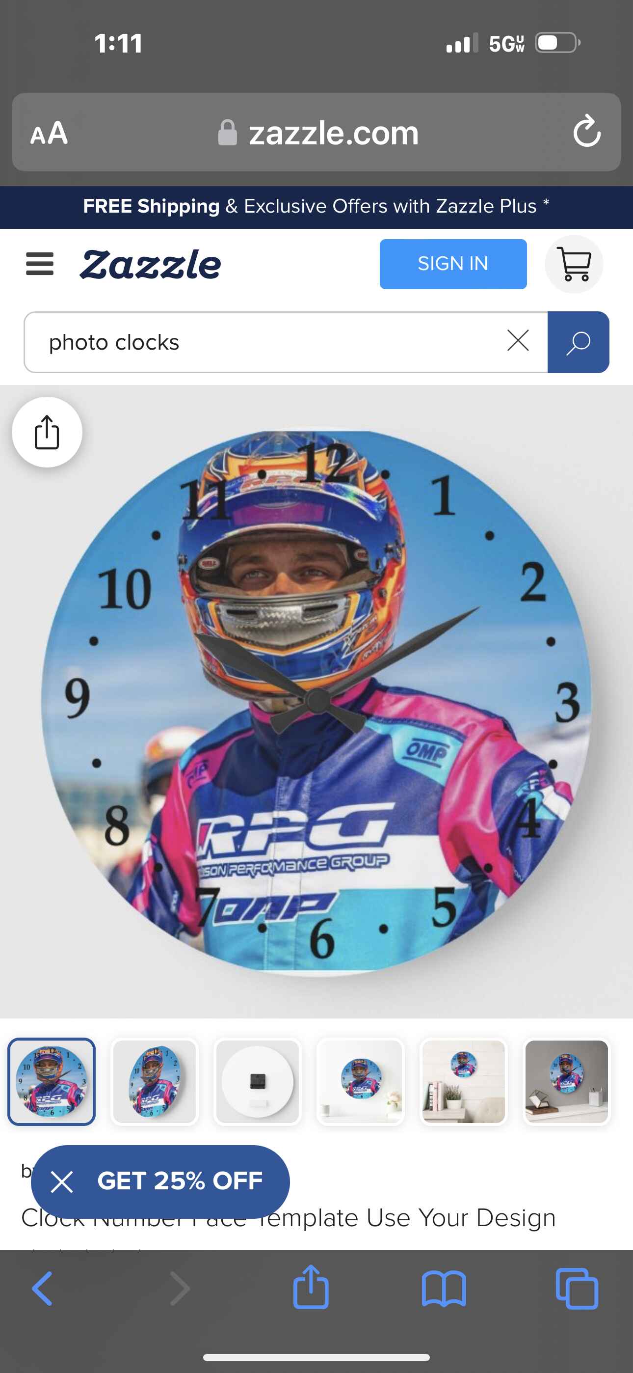
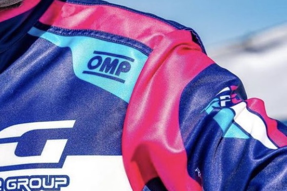
Hey, look at the printing on Ryan’s Suit:
So while this method seems like it’s printing the design like a laser printer, which means all sorts of detail, it’s kinda plasticy and the surface has no depth/texture.
Kinda ick, imho, but I’m guessing lightweight, and presumably less expensive than beautiful embroidery?
I figured out what bugs me… it’s that the colors aren’t fabric, they are a coating.
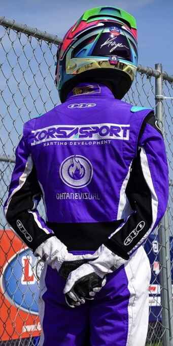
RPG should hire TJ to rework their look and suits! Korsasport is a distinctive look, always. I don’t associate RPG with any colors or branding.
RPG is pretty well known as the pink and purple karts. I don’t think they need my help.
Dye-sub print is indeed lighter and you can offer much more detail. Unlike embroidery, patterns, fades, overlays, and smooth gradients are possible.
Some would say the dimensional aspect of embroidery looks nicer or more luxurious.
To be fair, other than your livery I can’t think of any that are memorable from pro stuff on Xander’s show. I do like the RPG logo but overall I find the whole look just “ok”. It’s totally fine tho, and very pro. I guess it’s based on Kosmic colors. Everyone on the pro tour has awesome helmet paints, regardless of team suit, however.
The simulated cloth tab part is not my cup of tea. So shiny.
Dunno just prefer embroidery and cloth shapes and your aesthetic:
1 Like
One of Bob Ross’s paintings is going up for auction. I think all of his paintings are held by the estate, which makes them very rarely sold or something.
It’s not kArt but his advice is relevant. Should you be having a bad race, just enjoy the happy little trees all around you. Or corn, or whatever you’ve got.
3 Likes